
WHOL
A STUDY IN FORM AND MEANING
WHOL was created as a Pilates and wellness brand centered around movement, mindfulness, and holistic living.
Designed to feel calm, grounding, and deeply intentional, the brand encourages people to reconnect with themselves creating space for both personal growth and quiet moments of pause. At its core, WHOL is about more than physical wellness; it’s about building a sense of balance, community, and care that extends into everyday life.
The identity reflects this through a softer approach to strength; one that feels warm, elevated, and deeply human.

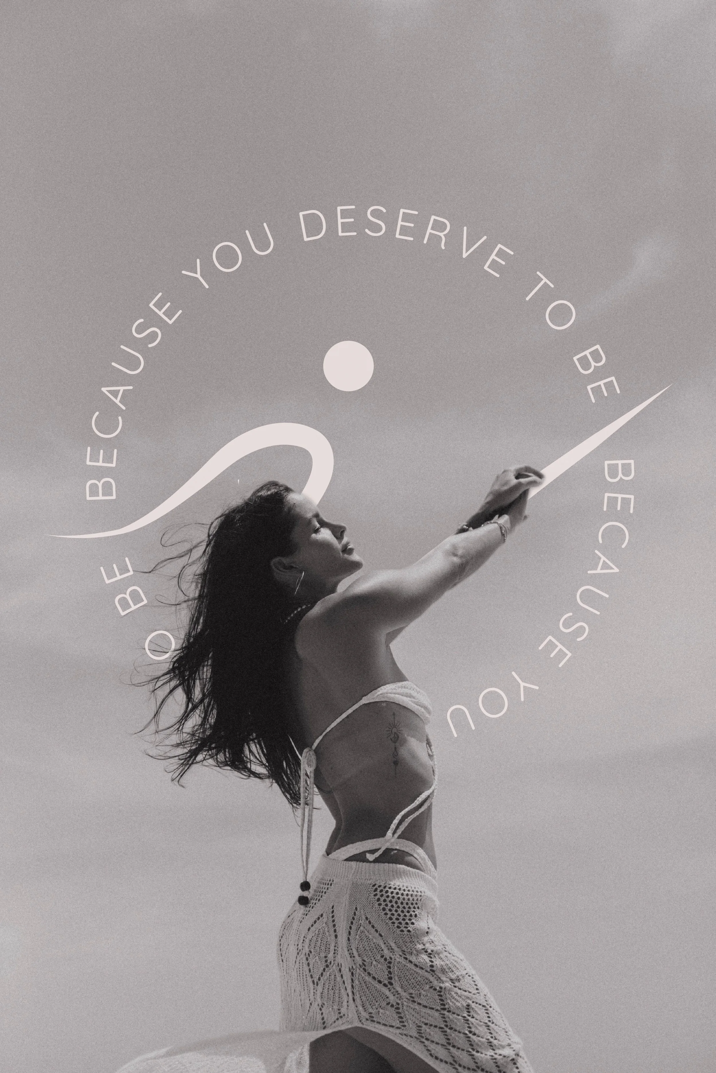
Photography courtesy Samantha Jackson
From the beginning, the intention was for the logo to carry meaning beyond aesthetics.
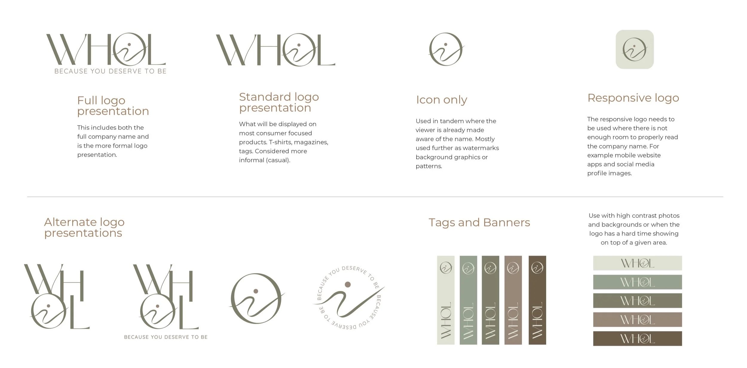
The mark was designed to reflect the flow and movement of Pilates, while subtly incorporating elements inspired by the Caribbean landscape where the brand is rooted. Soft, organic forms echo the rhythm of the ocean and the warmth of the rising sun, reinforcing ideas of balance, renewal, and wholeness.
Through simplicity and symbolism, the logo becomes more than a mark; it becomes a visual reflection of the brand’s philosophy.
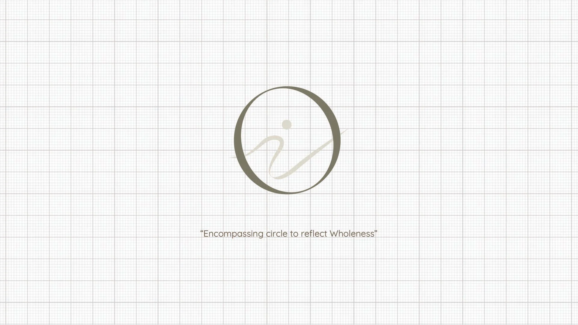

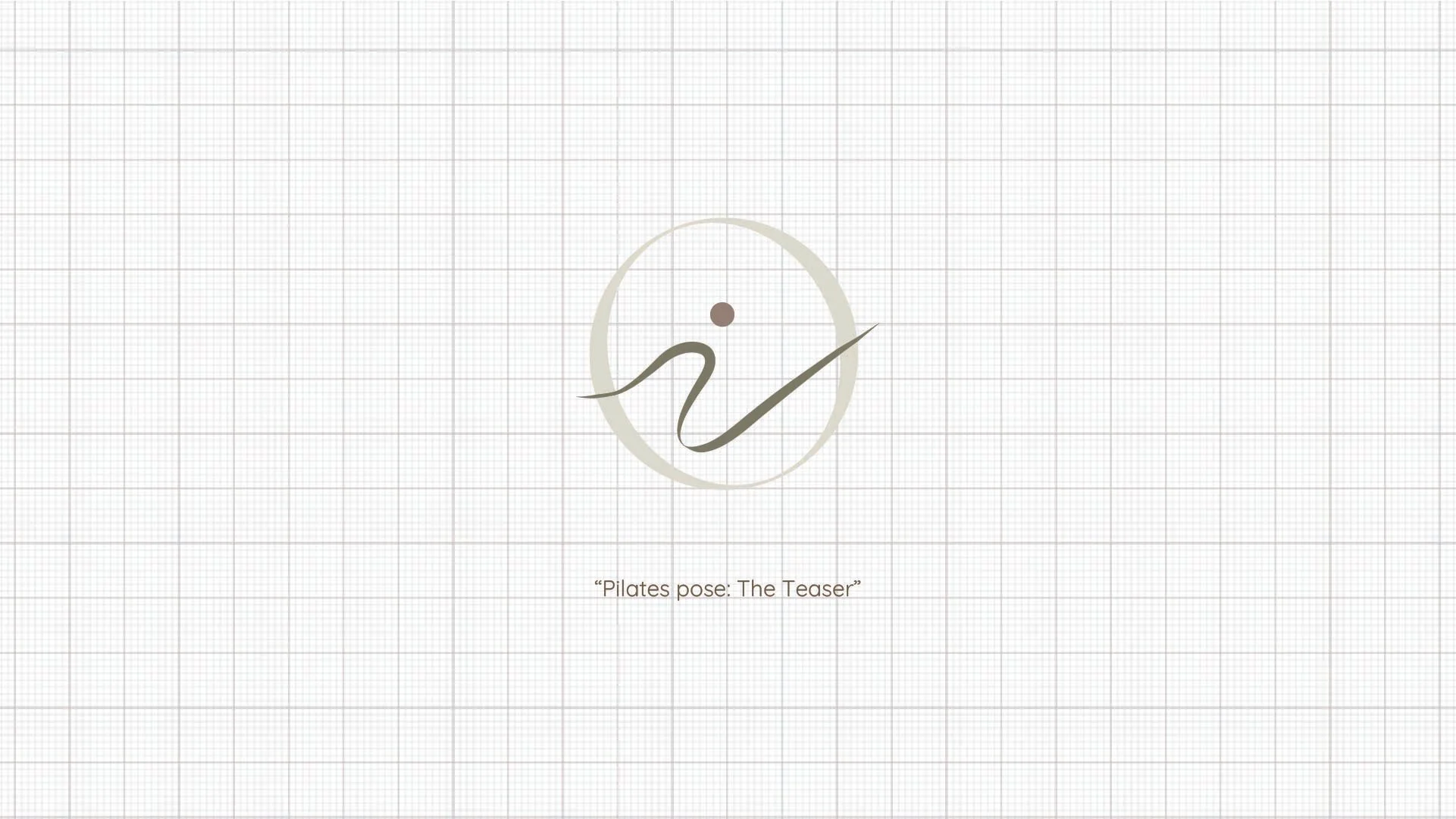
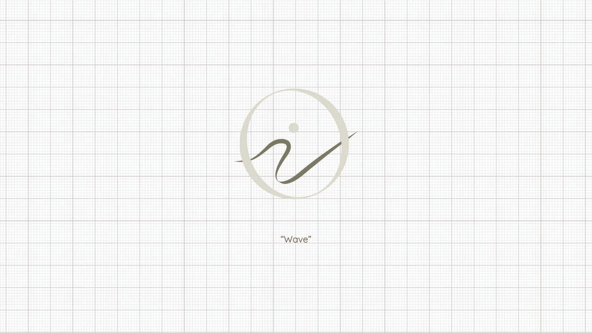
The identity was developed as a flexible system allowing the mark to shift naturally across different touchpoints while remaining visually consistent at its core.
Through its simplicity and considered structure, the logo scales effortlessly between large-format applications and smaller brand moments, creating a visual language that feels both adaptable and refined while still maintaining the calm and grounded feeling at the heart of the brand.
A muted palette of sage and warm neutrals reinforces this feeling drawing on ideas of renewal, balance, and connection to nature.
Together, these elements create a brand that feels serene, restorative, and quietly confident.
Beyond the logo, WHOL was designed to feel like a complete experience where every detail contributes to a sense of calm, connection, and ease.
From typography and colour to imagery and layout, the brand system was created to feel cohesive and restorative across every touchpoint. The balance of clean structure and organic softness gives the identity an elevated feel while still feeling warm, welcoming, and approachable.
Subtle pulls of Caribbean greenery and natural textures are woven throughout the imagery, bringing warmth and a quiet sense of place to the brand. Rather than leaning into obvious tropical elements, these details are introduced in a softer, more thoughtful way adding depth and atmosphere while staying true to the grounded feeling at the heart of WHOL.
At its core, the brand was designed to create a space where wellness feels personal, inspiring, and easy to connect with.
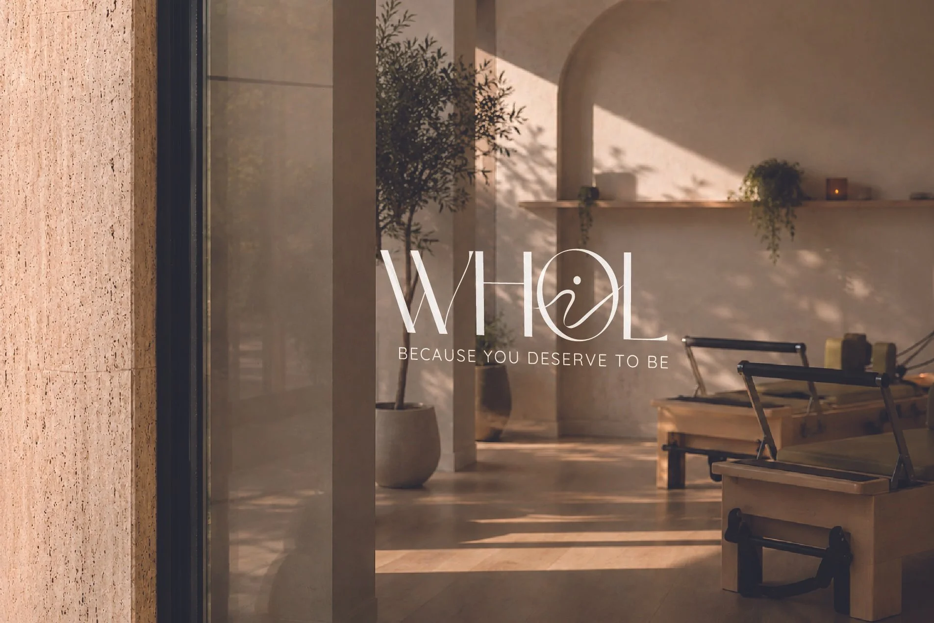
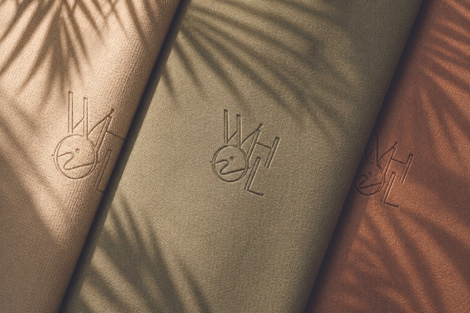

WHOL was designed to feel like more than just a brand, it was created to reflect a lifestyle rooted in balance, movement, and intentional living.
Through soft visuals, calming tones, and meaningful details, the identity creates a sense of both grounding and growth. Every element was designed to feel welcoming, restorative, and easy to connect with capturing a wellness experience that feels just as empowering as it does calming.
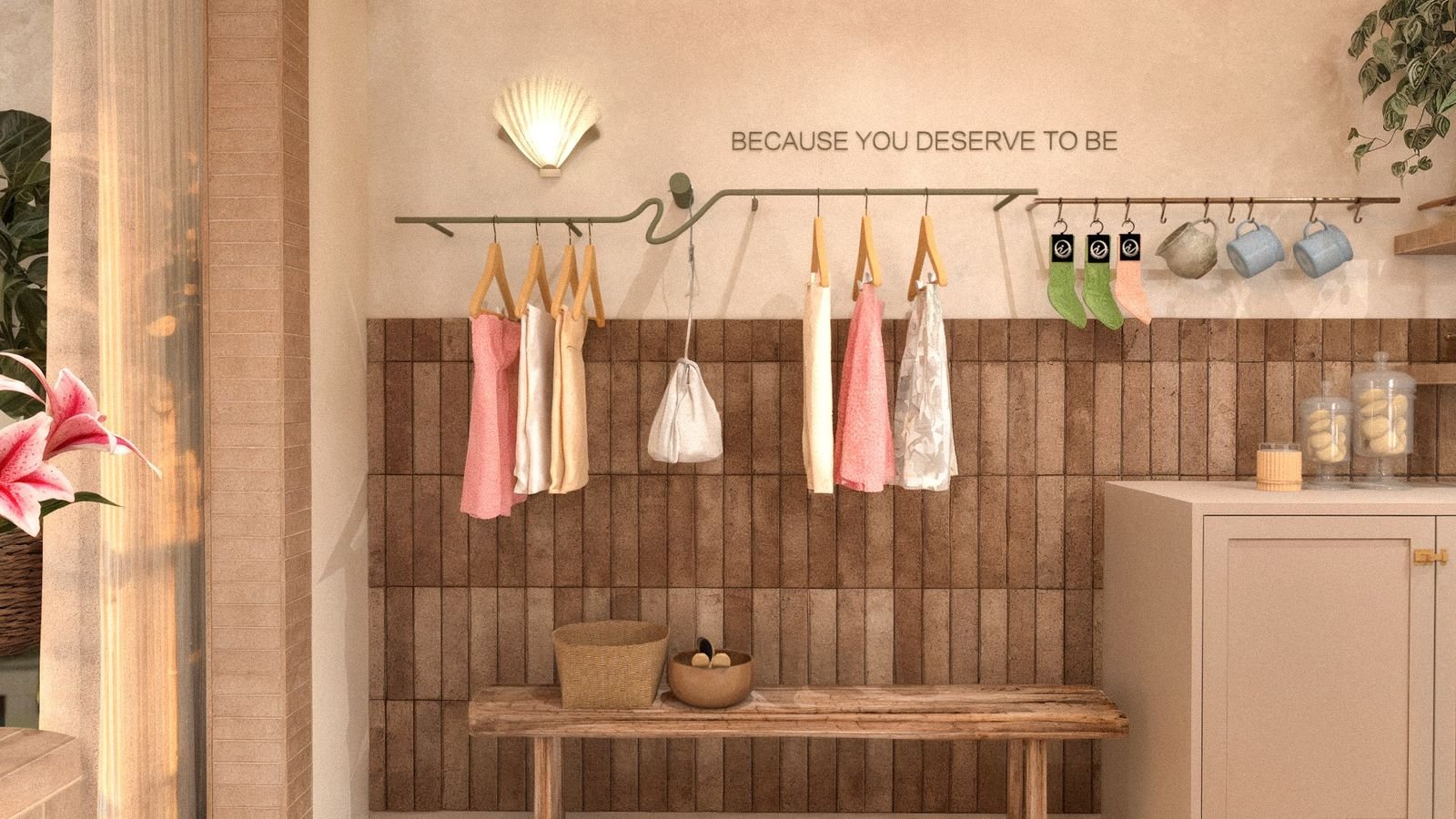
Rendering of the WHOL Pilates Studio by Hayley Knaggs of Knaggs & Co., thoughtfully integrating the brand identity into the space through a custom merchandise display inspired by the WHOL logo.