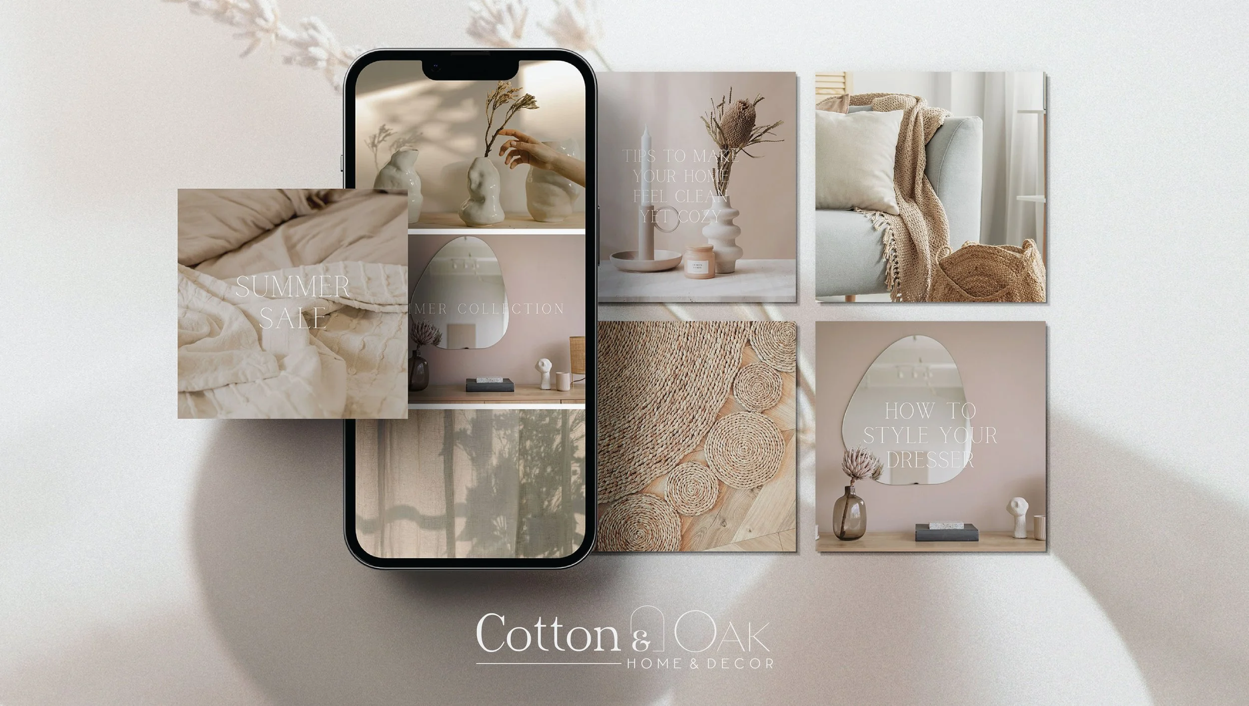
COTTON & OAK
DESIGNING QUIET LUXURY FOR THE MODERN HOME
Cotton & Oak was designed as a study in softness and structure where delicate textures meet grounded materials, and where home feels both elevated and lived-in.
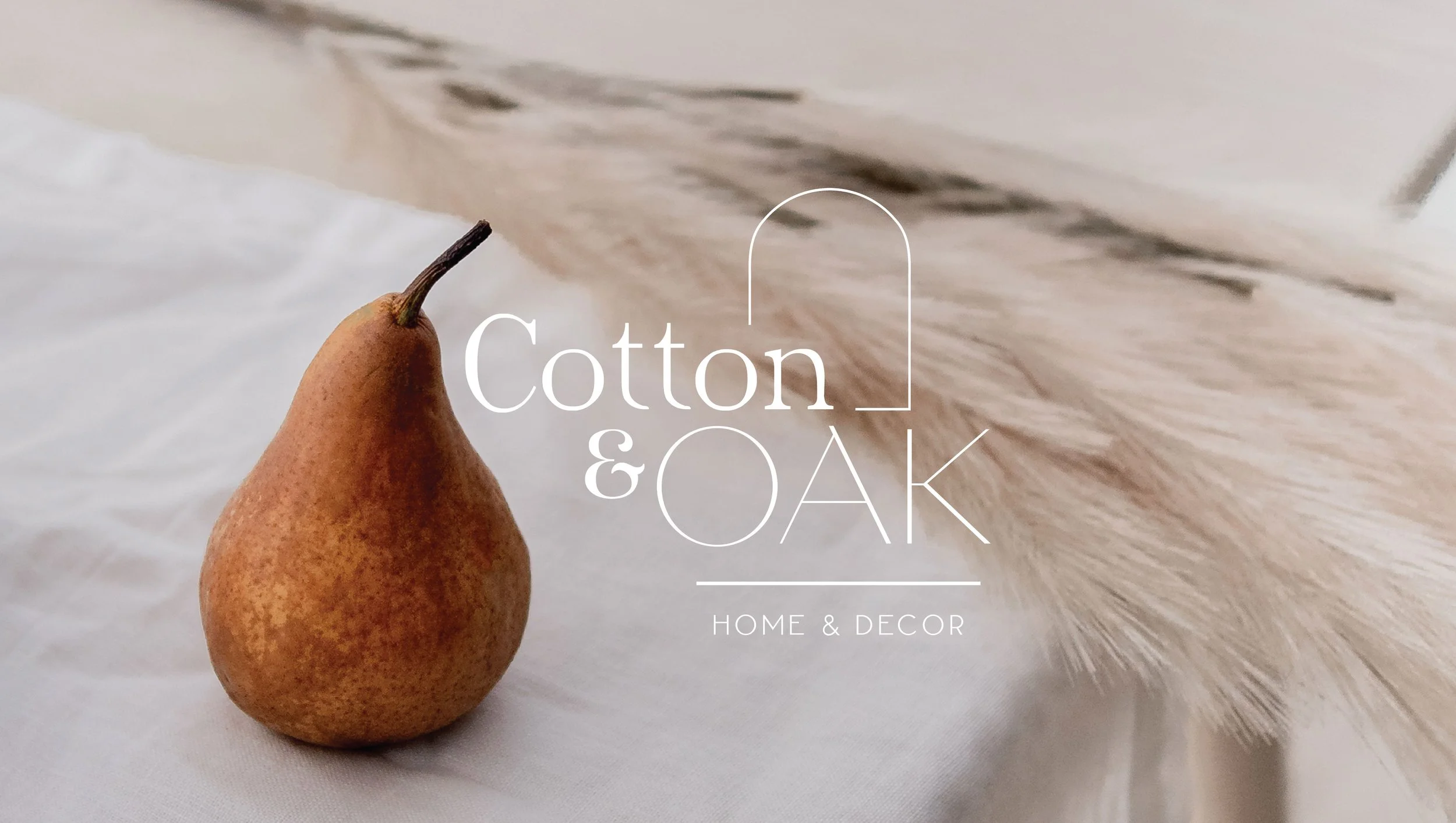
Inspired by the tactile contrast of cotton and oak, the brand is rooted in balance:
light and grounding, refined yet familiar.
It’s a quiet kind of luxury, designed not to overwhelm, but to settle in.
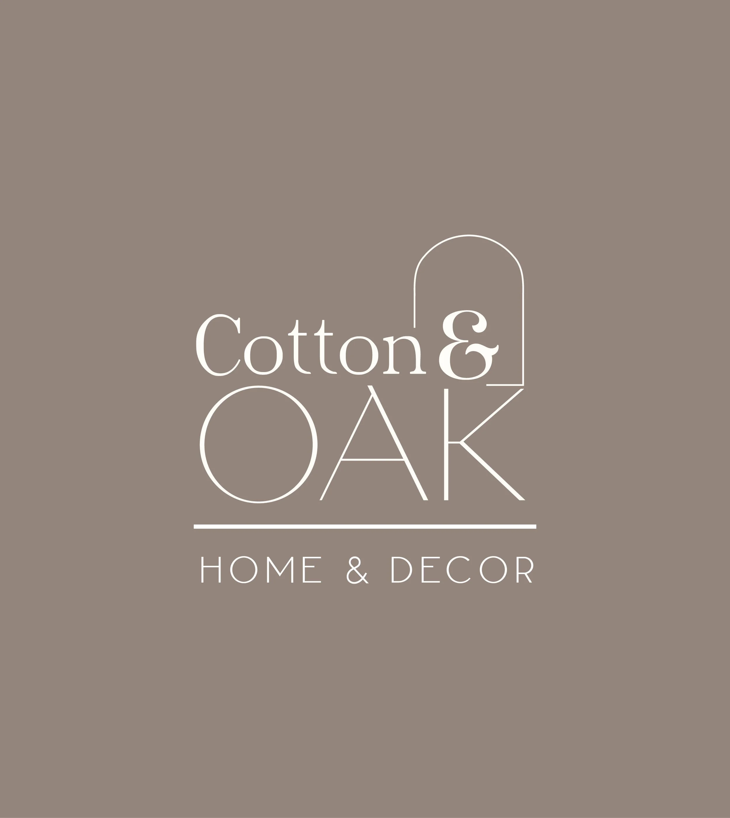
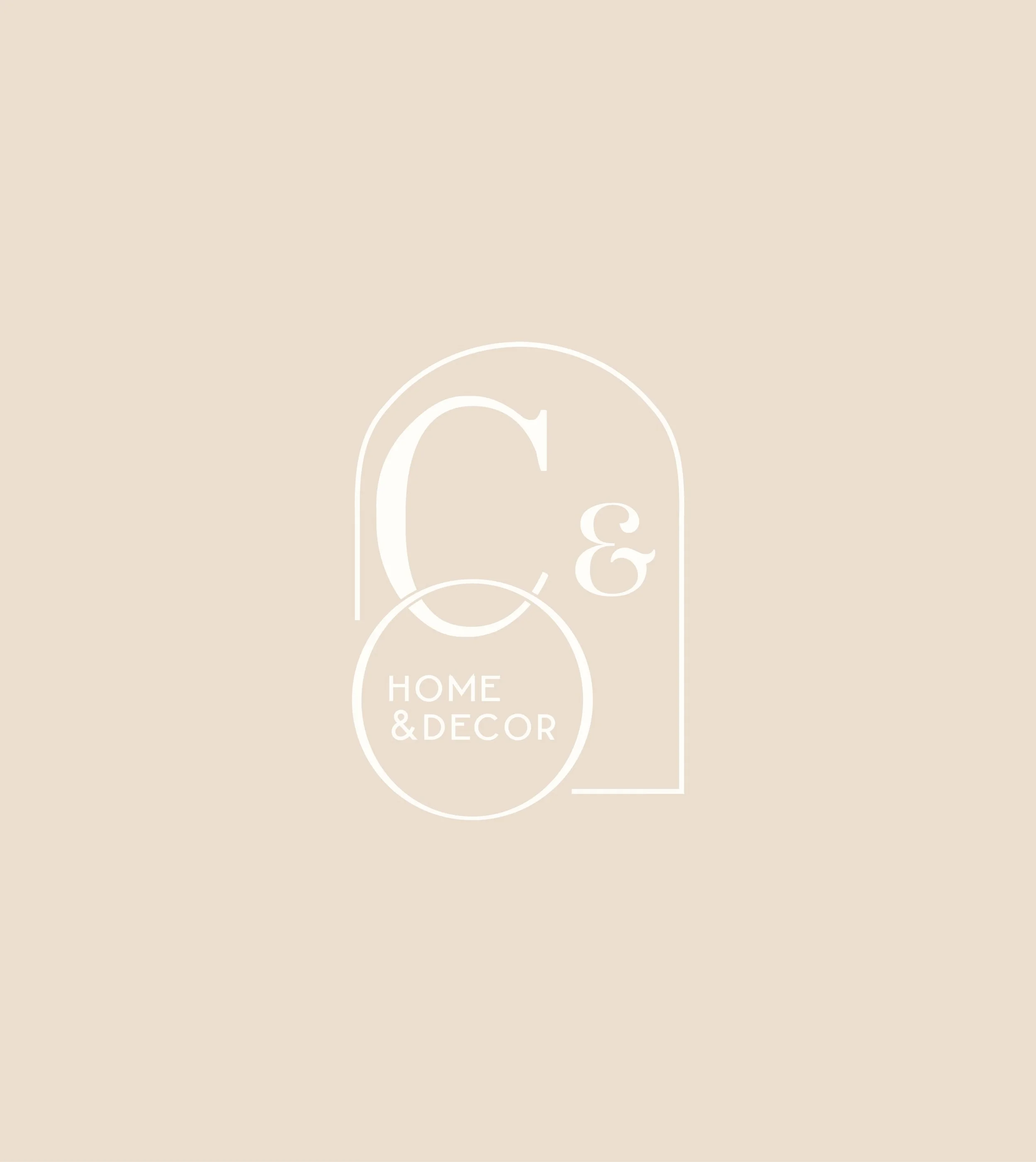
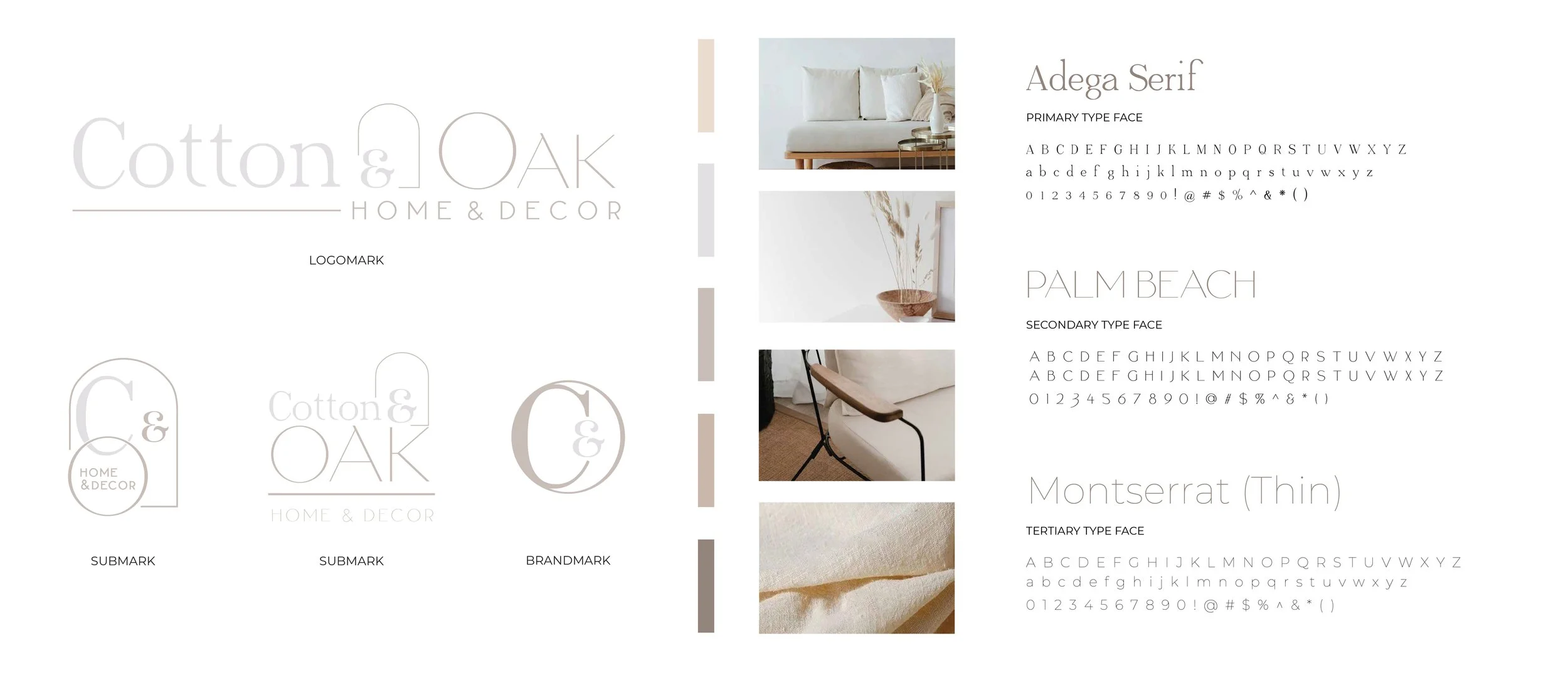
Cotton & Oak’s identity is rooted in restraint where every element is designed to feel intentional, yet effortless.
At its core, the brand balances softness with structure. Refined serif typography introduces a sense of timeless sophistication, while clean, modern letterforms create contrast and clarity. This interplay allows the identity to feel elevated without becoming rigid, and contemporary without losing warmth.
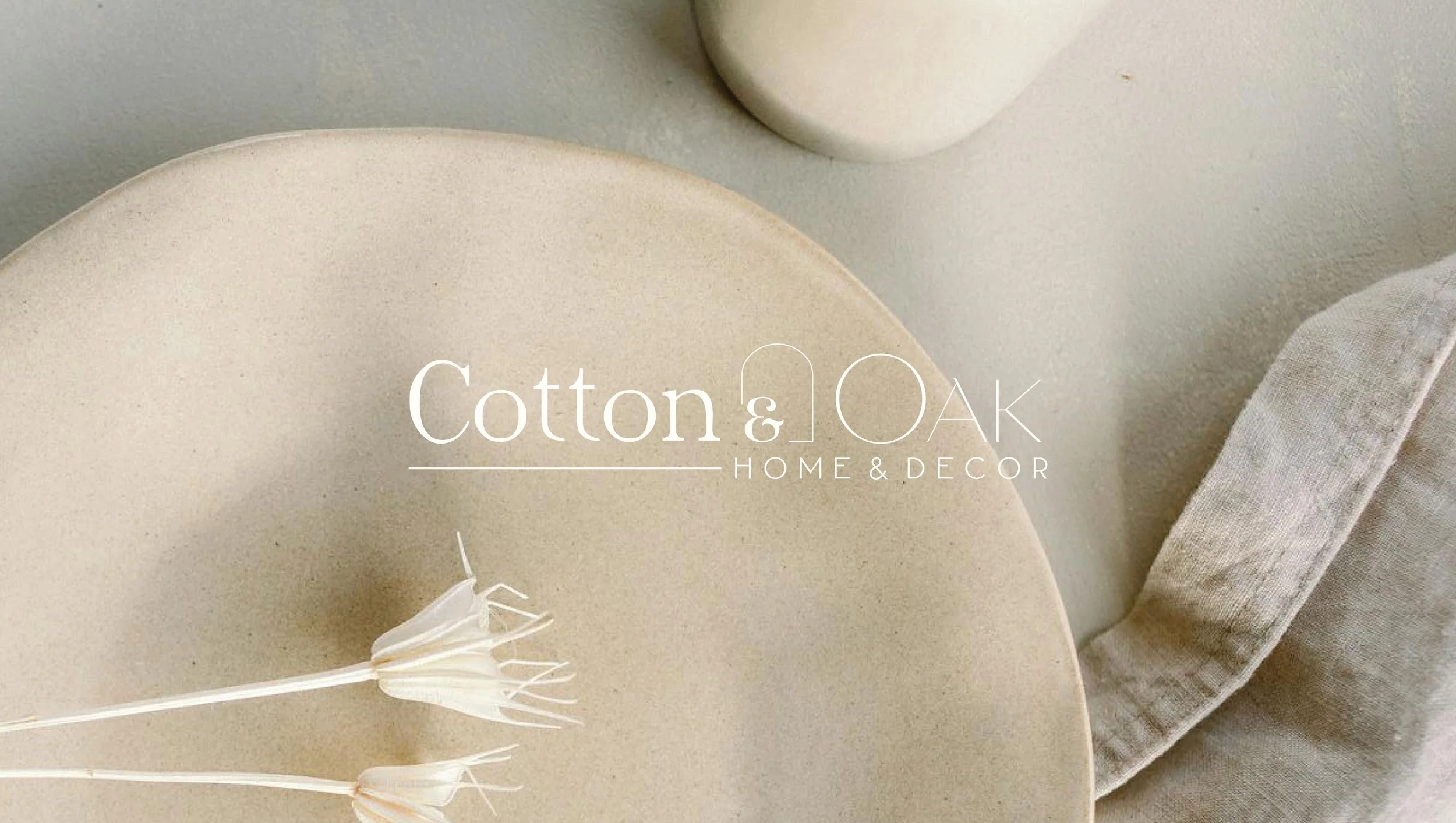
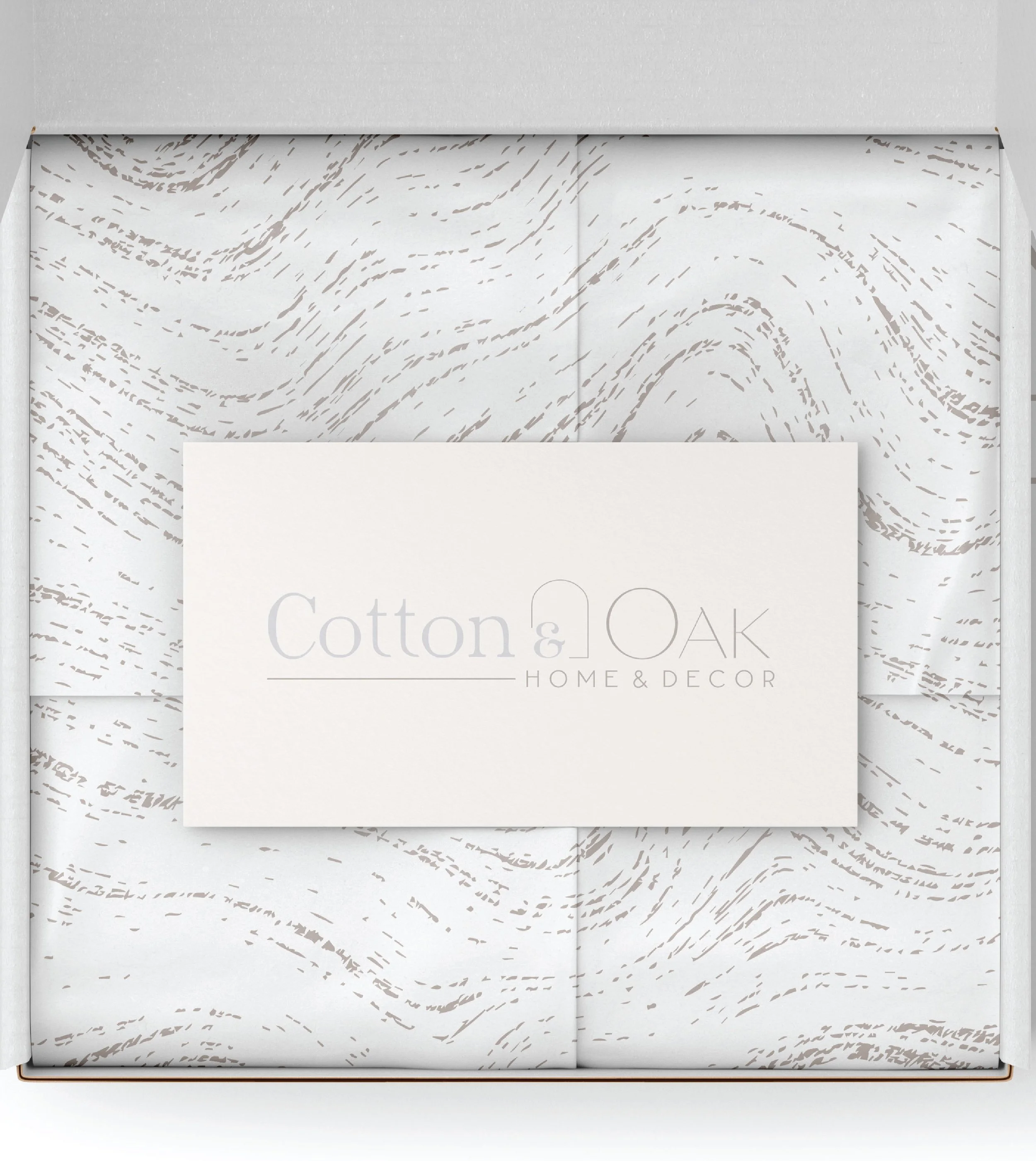
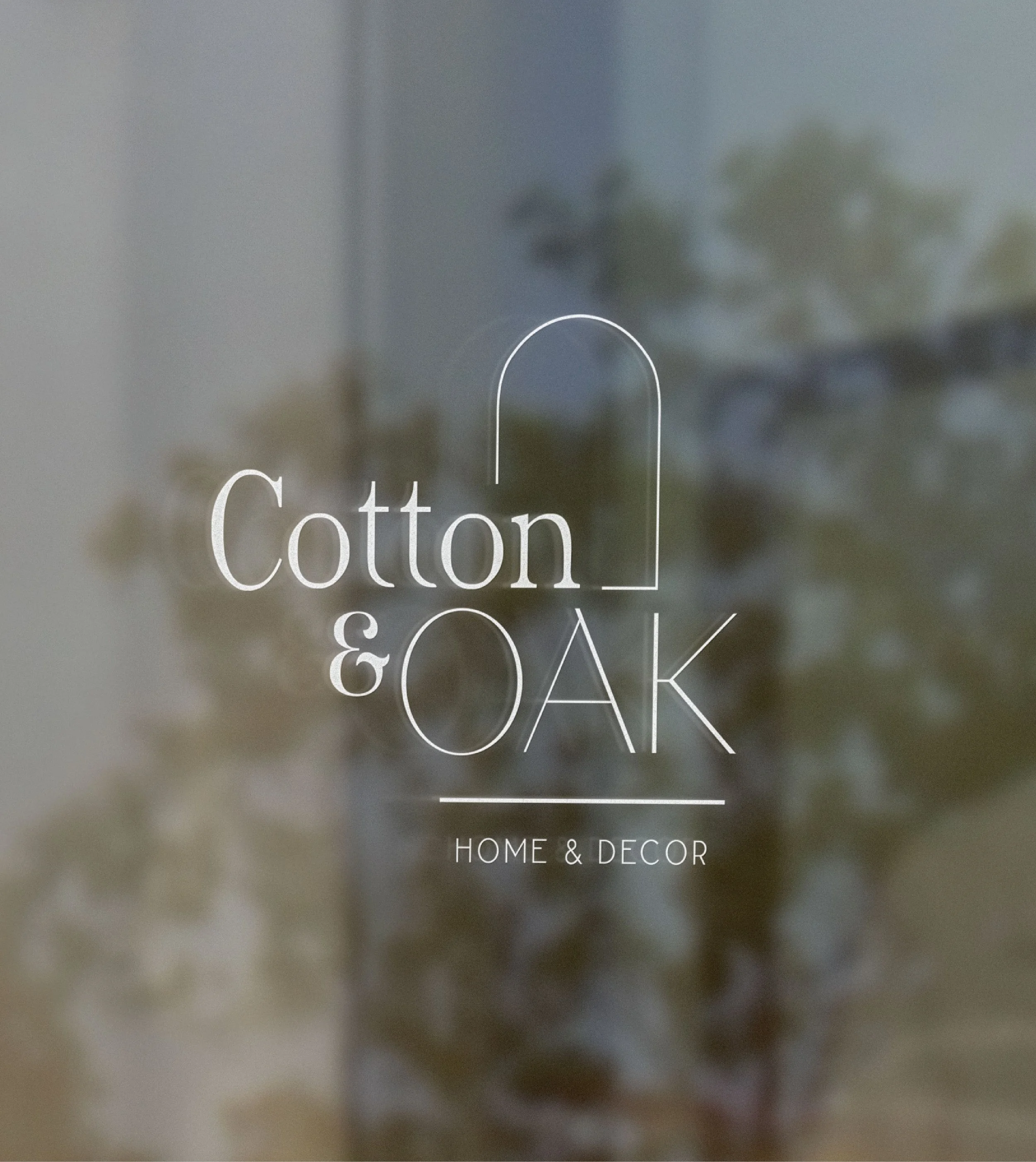
The logomark draws on a subtle architectural influence, with an arched form that gently frames the brand. It introduces structure without harshness, softening the overall identity while reinforcing a sense of home and permanence.
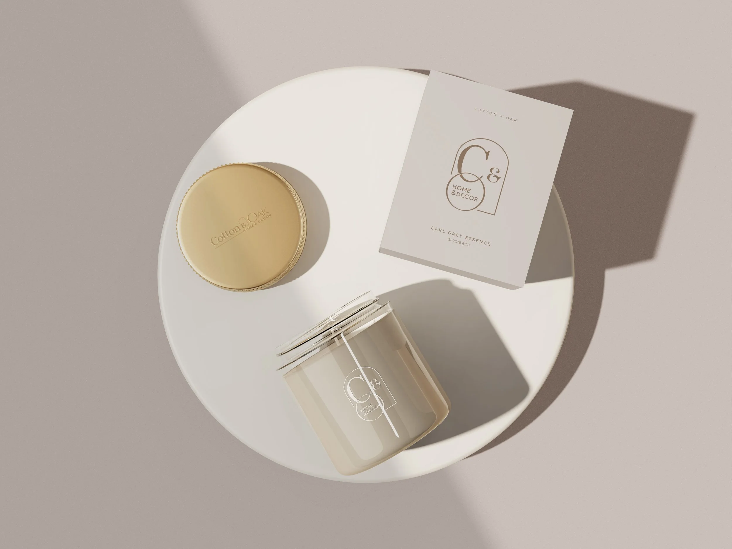
A warm, neutral palette grounds the system, inspired by natural materials: linen, wood, and stone. Rather than relying on contrast, the brand builds depth through tone and texture, allowing each element to quietly complement the next.
Together, these elements form a visual language that is calm, cohesive, and designed to be experienced.
Cotton & Oak is an exercise in restraint; where softness meets structure, and materiality is allowed to breathe.
Guided by the belief that there is power in simplicity, the brand unfolds quietly, with intention in every detail.
Cotton & Oak is an exercise in restraint; where softness meets structure, and materiality is allowed to breathe.
Guided by the belief that there is power in simplicity, the brand unfolds quietly, with intention in every detail.