ROOSTER’S TAIL
THE ART OF ADAPTATION
Rooster’s Tail was designed as a brand with range: crafted to move seamlessly between elevated hospitality and vibrant retail.
A Grenadian-based cocktail brand, Rooster’s Tail offers expertly pre-mixed blends developed by world-class mixologists bringing a refined cocktail experience into both social and everyday settings.
With flexibility at its core, the identity was built to transition effortlessly from the polished ambiance of hotels and bars to the energy of retail shelves while maintaining a cohesive and recognizable presence throughout.
It’s a brand designed to adapt without ever losing its character.


AN ELEVATED EXPRESSION
(HOSPITALITY)
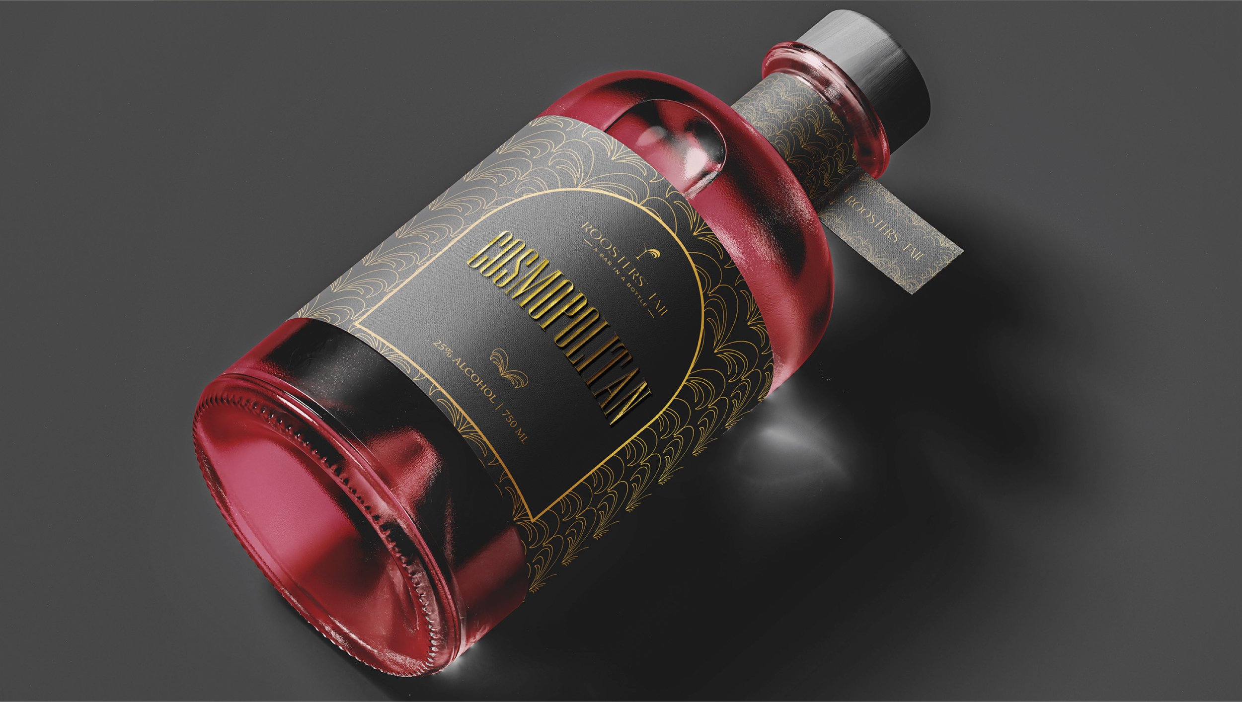
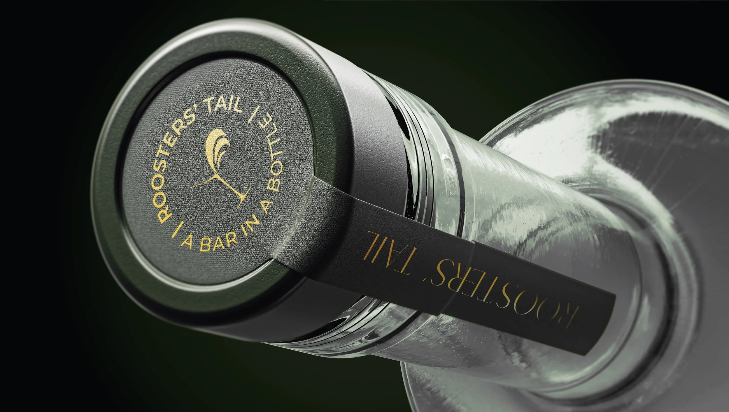
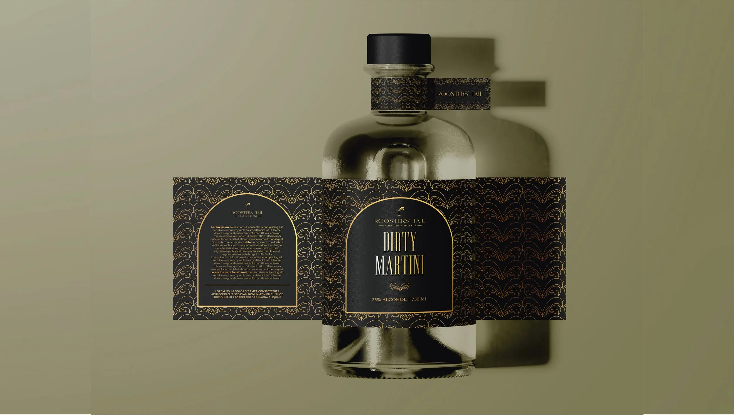
Within hospitality, Rooster’s Tail takes on a more composed expression as it’s designed to sit naturally within the atmosphere of refined cocktail spaces.
The identity shifts into deeper tones and richer finishes, where subtle pattern, considered typography, and controlled layouts create a sense of quiet confidence. There’s a focus on balance and restraint, allowing the brand to feel elevated without ever feeling overstated.
Here, the experience is as important as the product itself. Every detail is designed to complement the ritual of cocktail culture inviting a slower, more intentional moment with every pour.
A VIBRANT TWIST
(RETAIL)
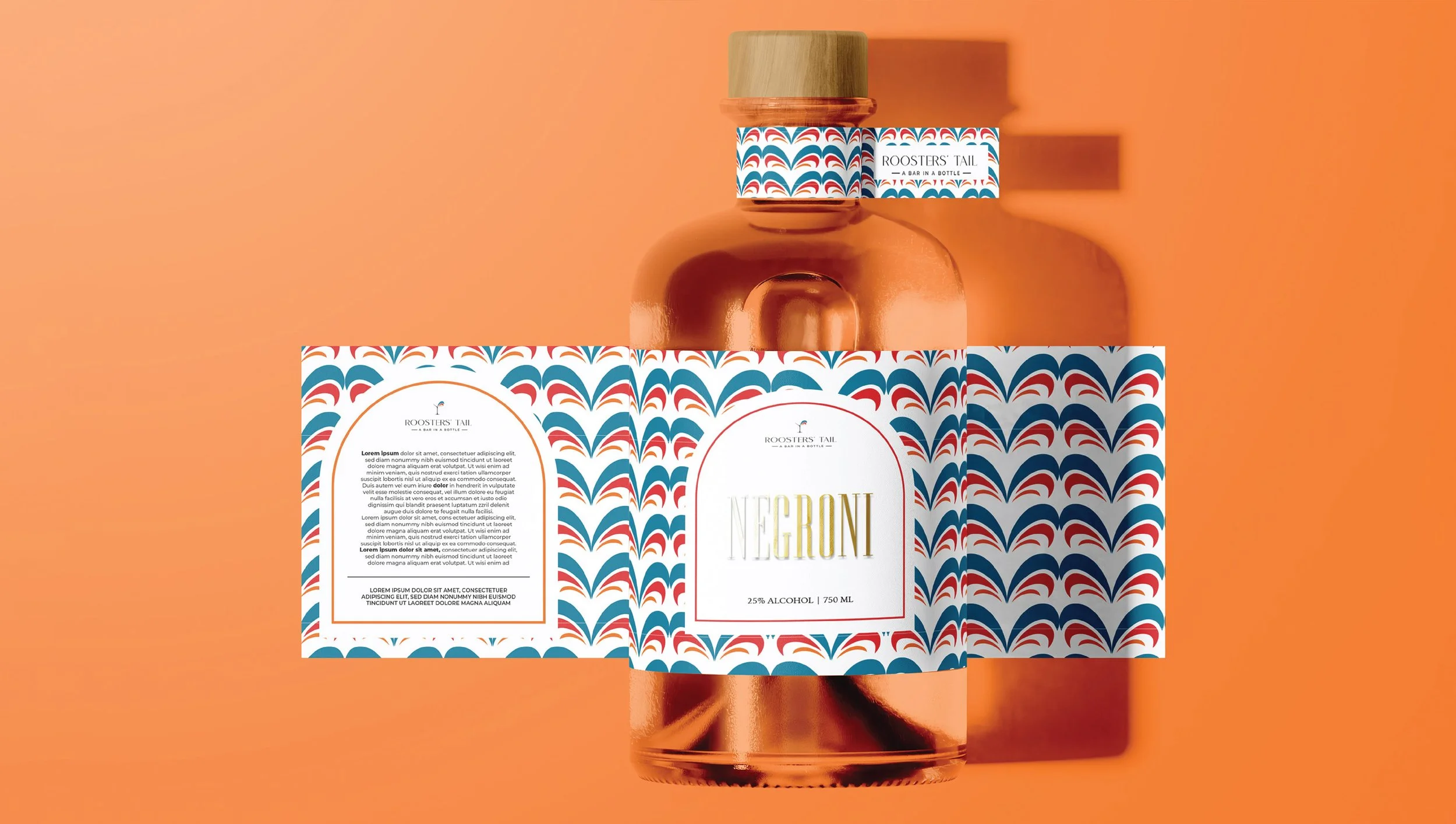
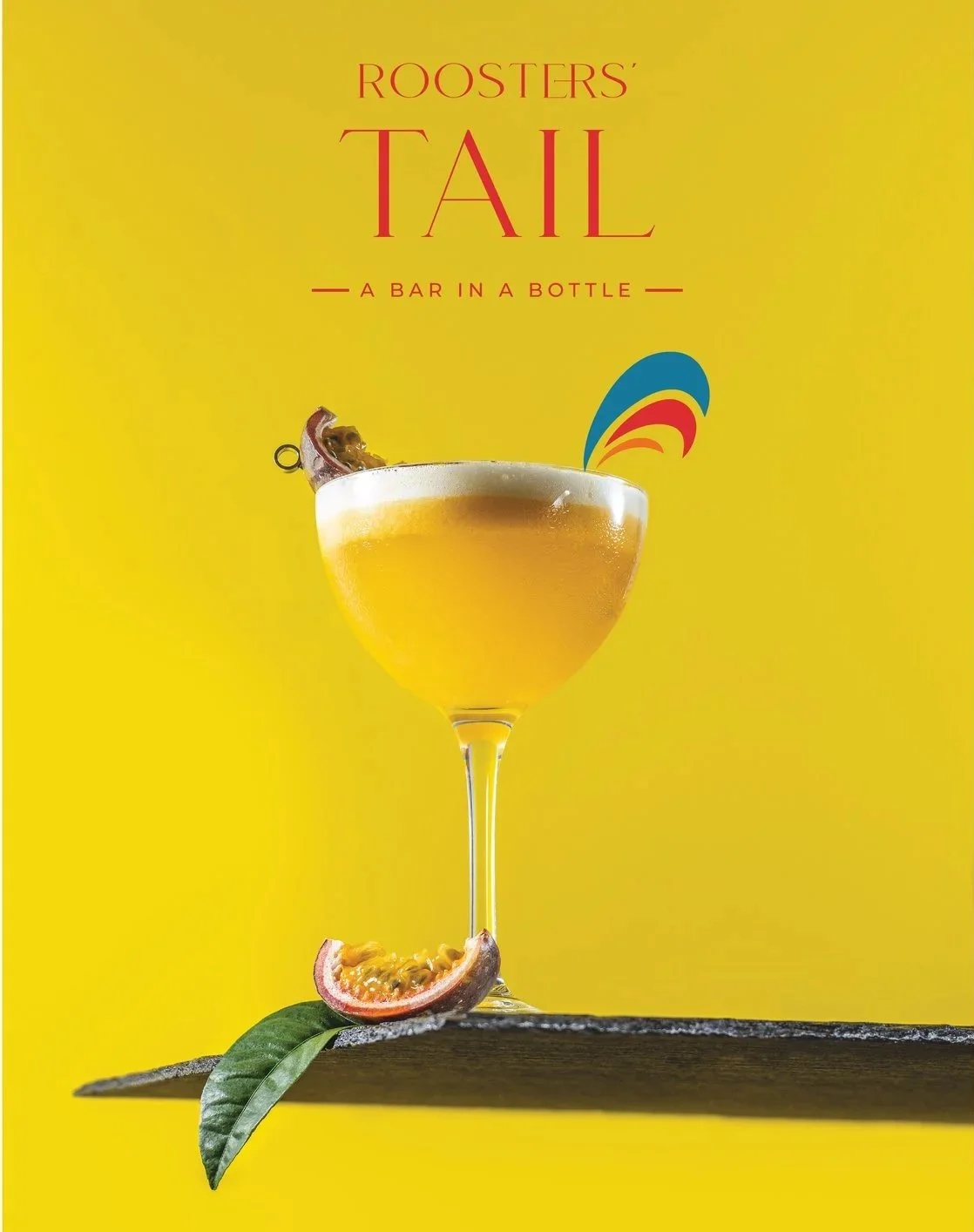
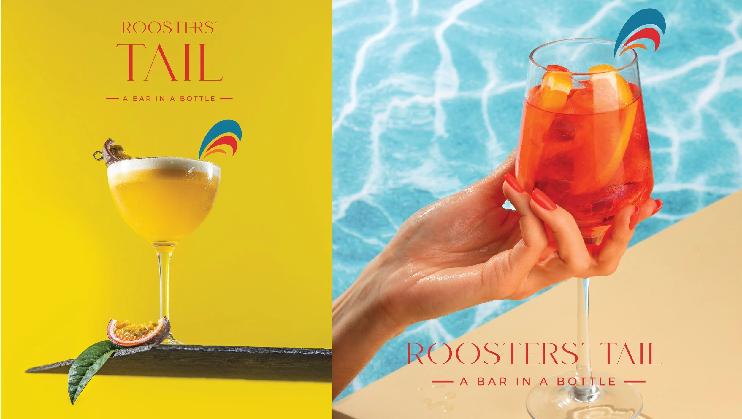
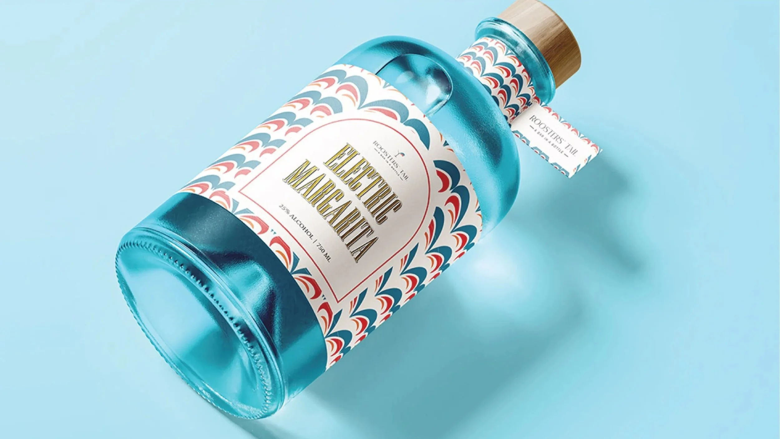
On shelf, Rooster’s Tail takes on a lighter, more playful tone bringing a brighter, more expressive energy to the brand.
Bright colour, expressive layouts, and a more relaxed energy bring the brand to life in a way that feels both eye-catching and approachable. It captures the spirit of cocktail culture in a way that feels less formal, and more social.
While the mood shifts, the identity remains grounded ensuring the brand always feels cohesive, no matter where it lives.
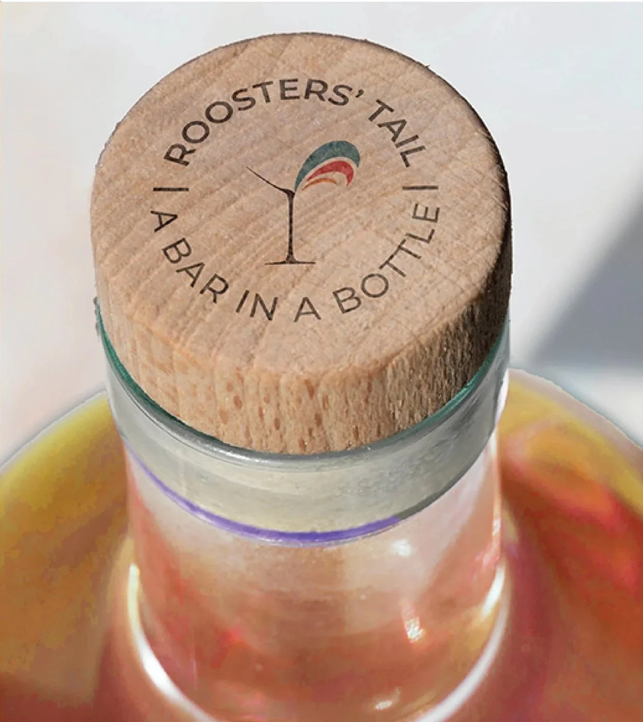

Rooster’s Tail was built to move between worlds—and to feel just as natural in each.
From the quiet sophistication of the bar to the lively presence of the shelf, the brand shifts in tone without ever losing its rhythm. It’s expressive when it needs to be, refined when it matters, and always unmistakably itself.
Flexible by design and grounded in consistency, it proves that a brand can have the best of both worlds.