HERS
BOLD BY NATURE
HERS began as a rejected design direction for a non-profit feminine care organization, but the concept had far too much personality to leave behind.
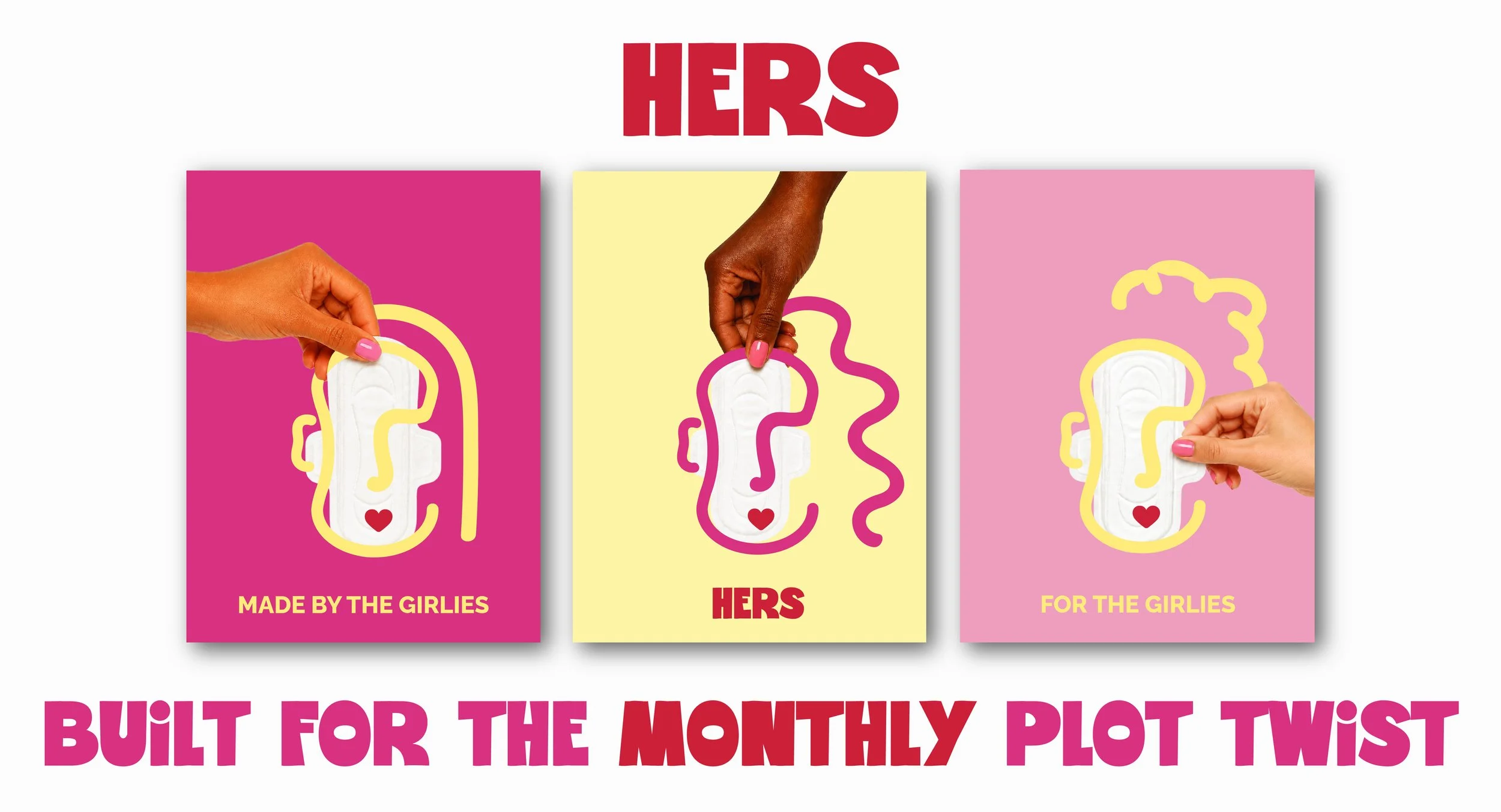
What started as an unused idea quickly evolved into a passion project exploring a bolder, more expressive take on feminine care branding for a new generation. Rejecting the overly clinical and muted aesthetic often associated with period care, HERS embraces vibrant colour, playful illustration, and personality-filled packaging to create a brand that feels confident, relatable, and impossible to ignore.
Designed to feel open rather than hidden, HERS turns everyday feminine care into something more empowering, expressive, and unapologetically full of Girl Power!

HERS’ identity was designed to feel loud, expressive, and instantly recognizable balancing bold visuals with a sense of fun and personality.
Playful typography, illustrated elements, and vibrant colour pairings give the brand an energetic, confidence-filled feel, while custom patterns and graphic details bring movement and individuality across the entire system.
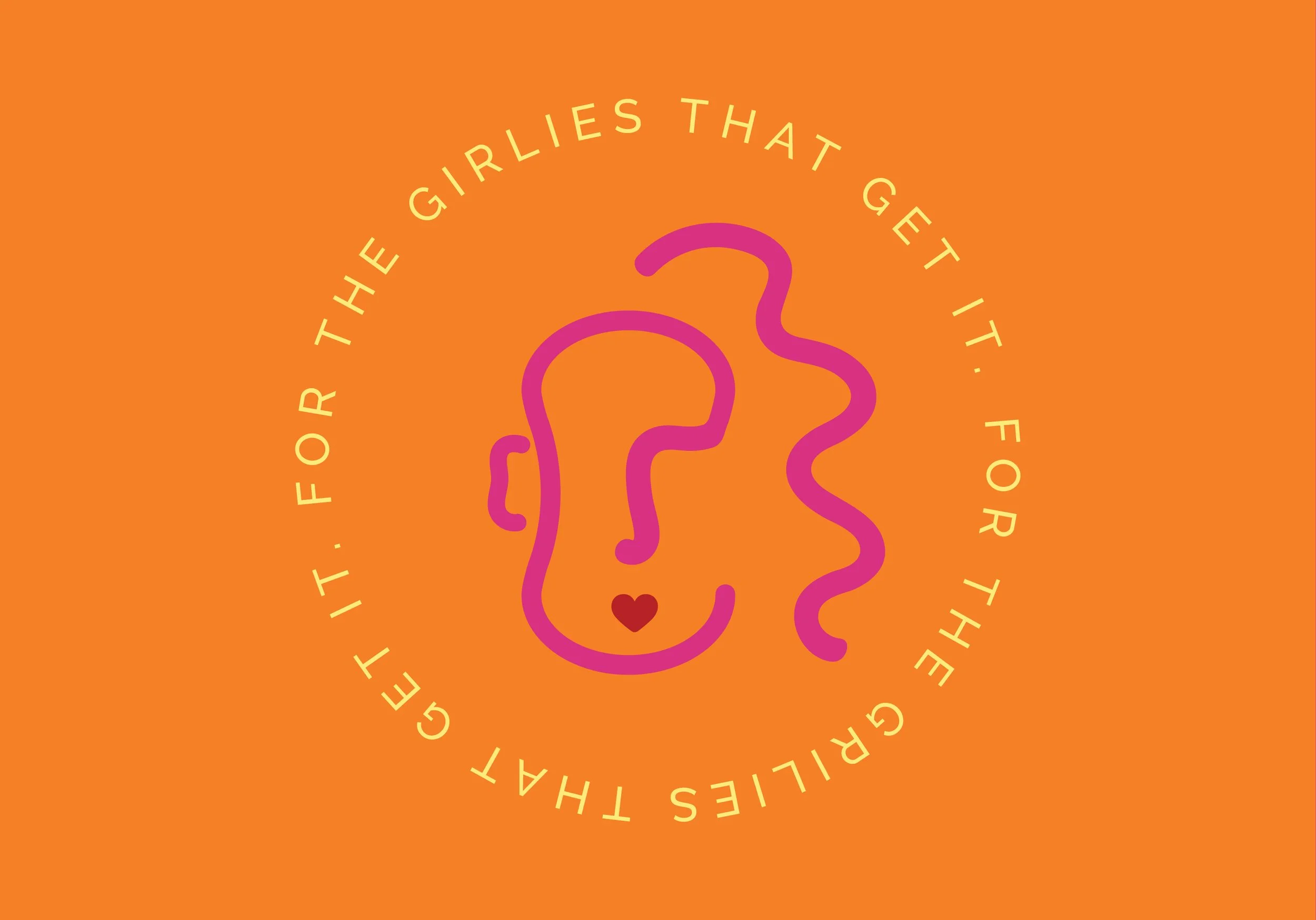
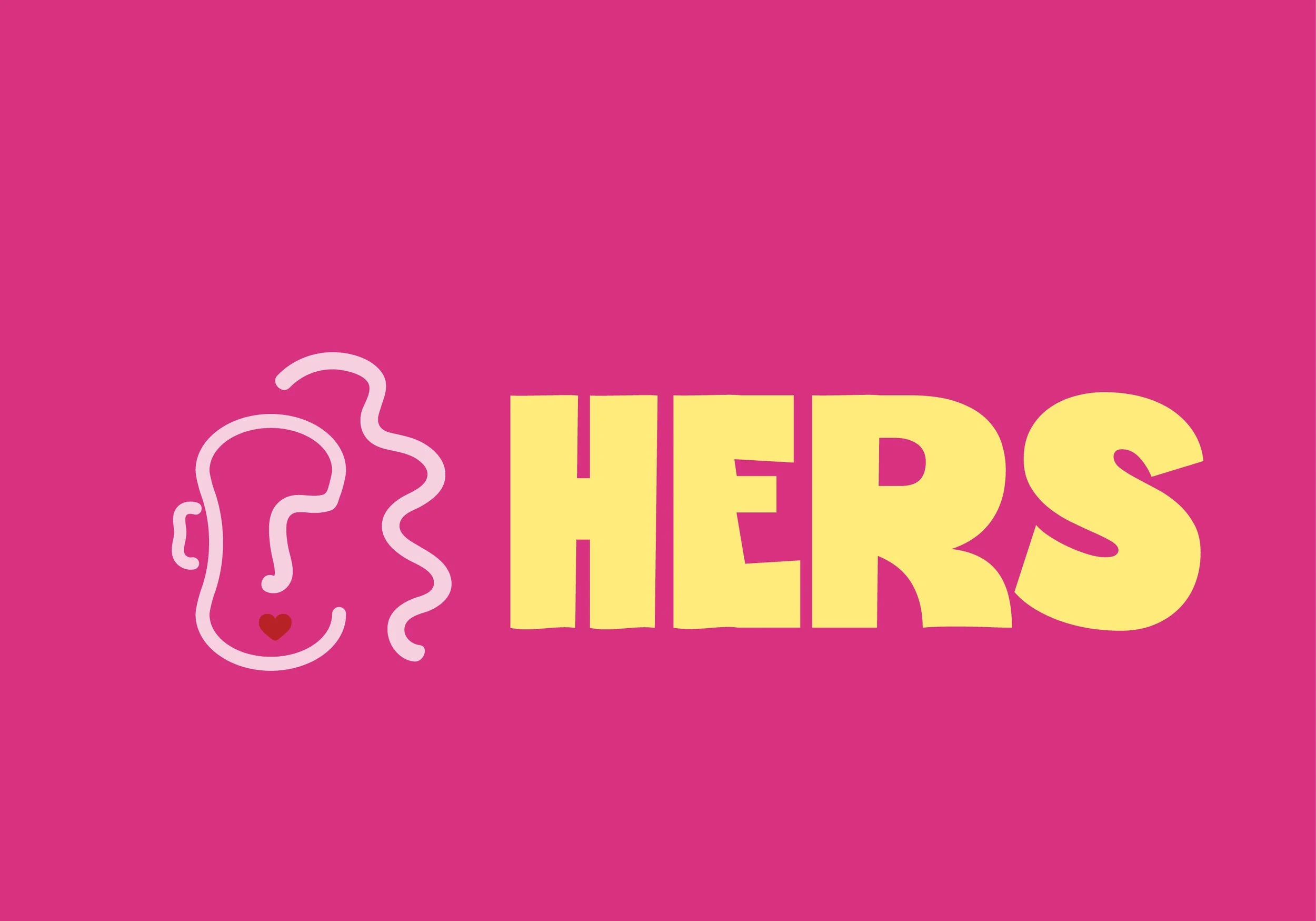
At the heart of the identity is a custom logo icon designed to resemble both the outline of a pad and the face of a girl tying the product directly back to the people it was created for. The mark adds a playful, human element to the brand, helping it feel more relatable, self-aware, and full of character.
Even with its bold and vibrant aesthetic, the identity still feels cohesive through recurring illustrations, consistent forms, and a strong visual rhythm allowing the brand to feel expressive without losing clarity.
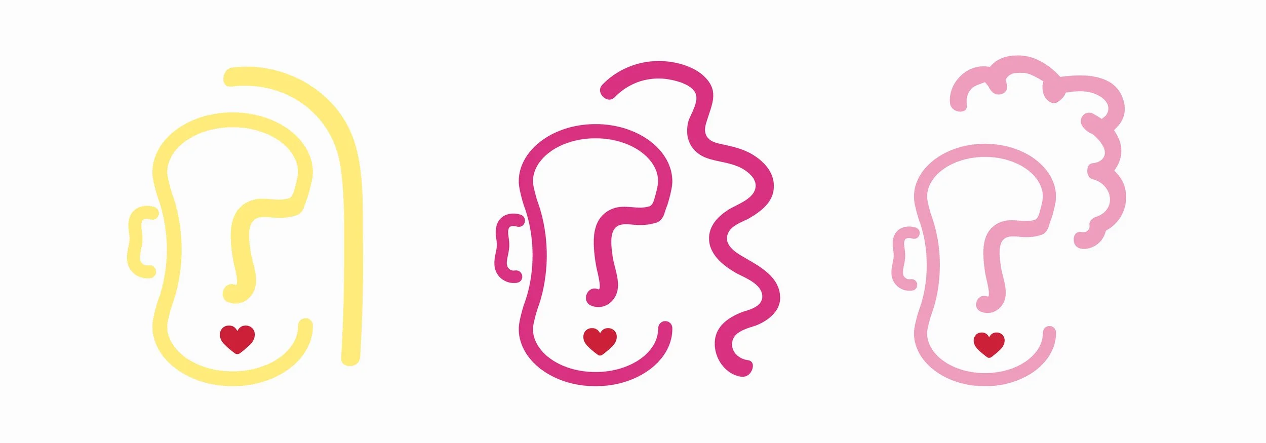
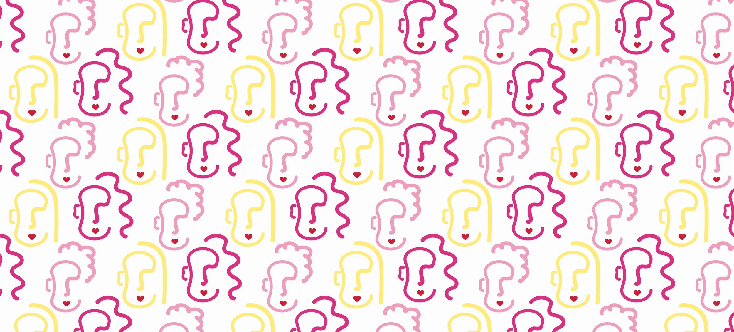
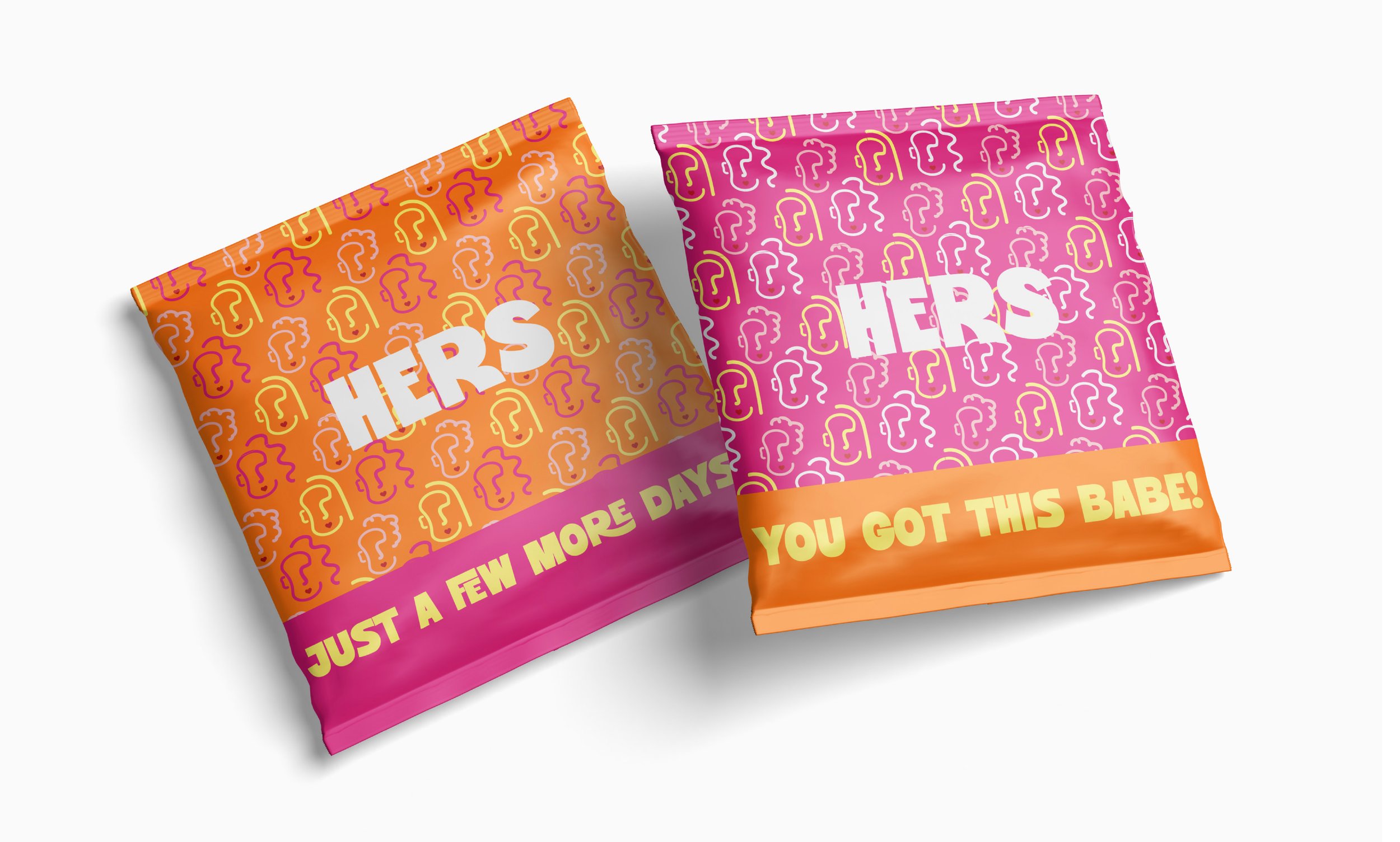
The three main character illustrations were developed as playful extensions of the logo icon using the recognizable pad-shaped face while changing each character’s hairstyle and personality to represent a wider range of girls and identities. Together, they help the brand feel more inclusive, expressive, and deeply connected to the audience it was designed for.
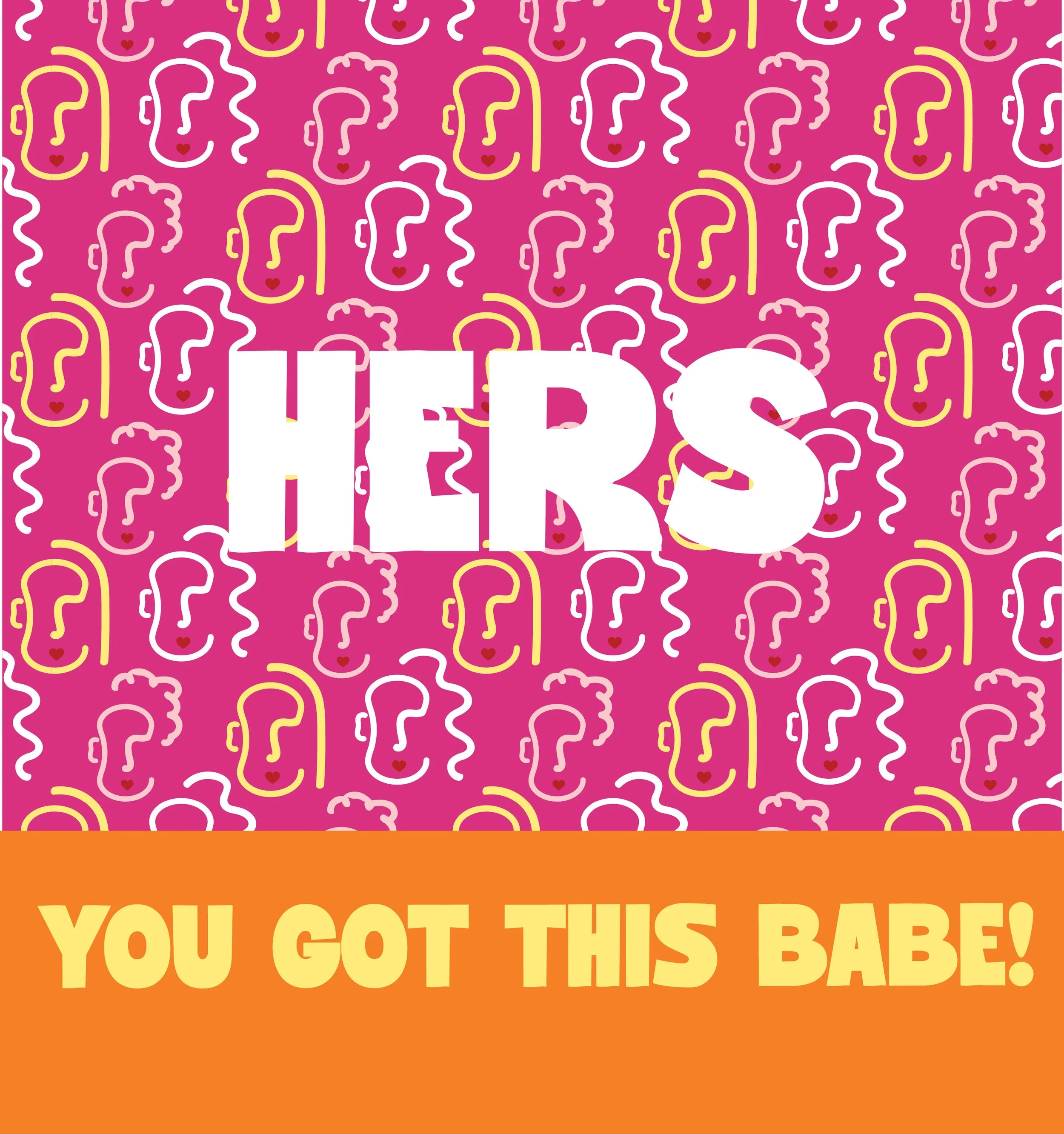
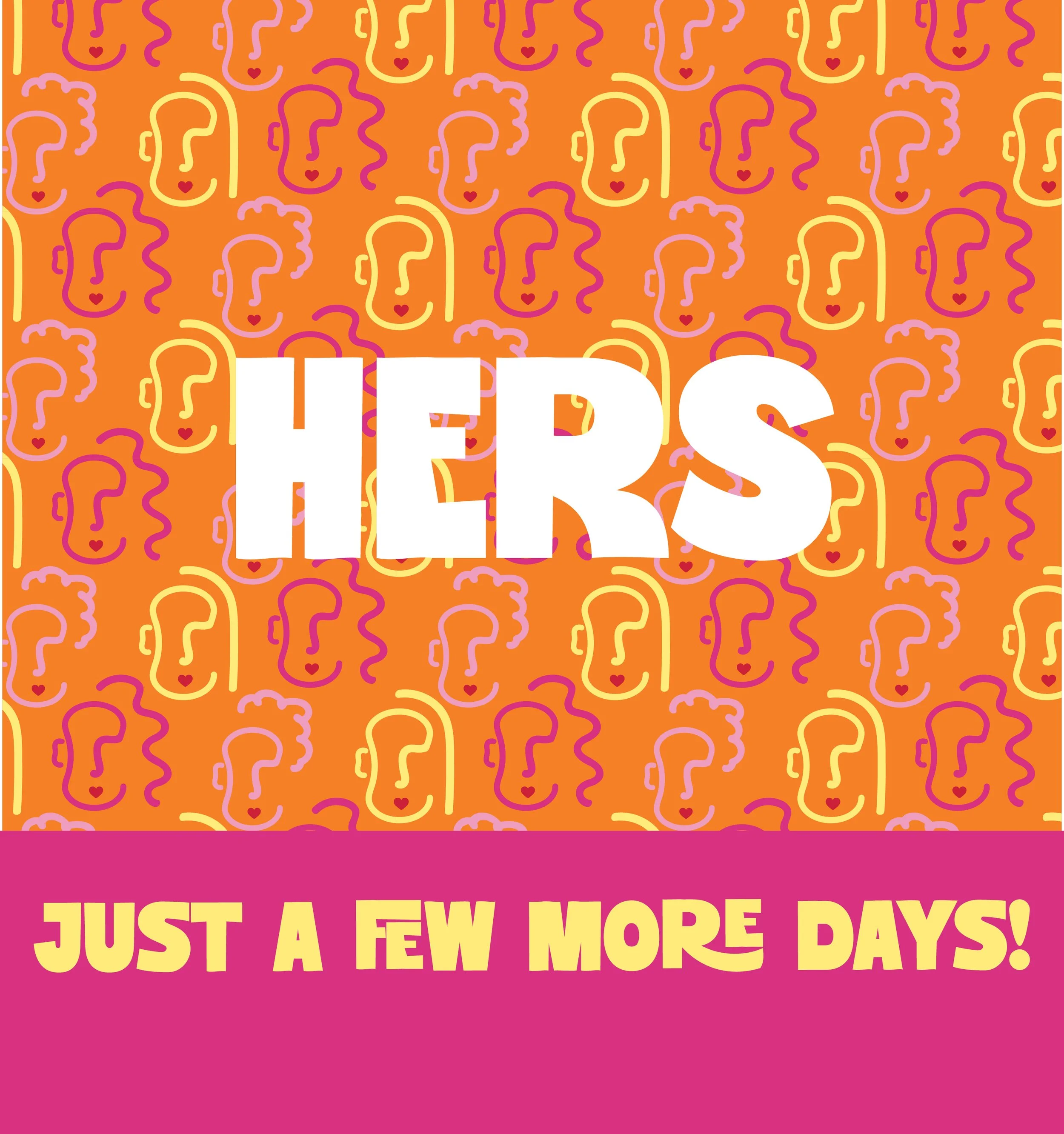
Each illustration brings its own energy to the brand, adding individuality, relatability, and a sense of fun throughout the packaging and campaign visuals. The characters also work together as a repeatable graphic system, allowing them to be transformed into playful brand patterns that bring even more movement, personality, and recognition across the overall identity.
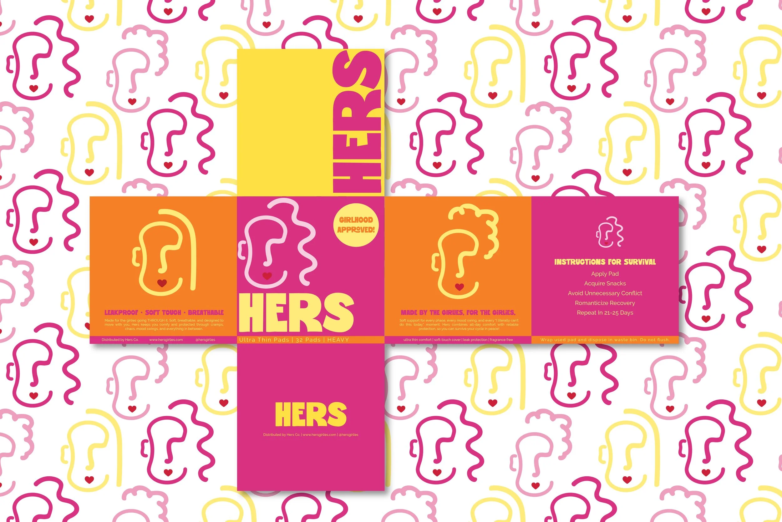
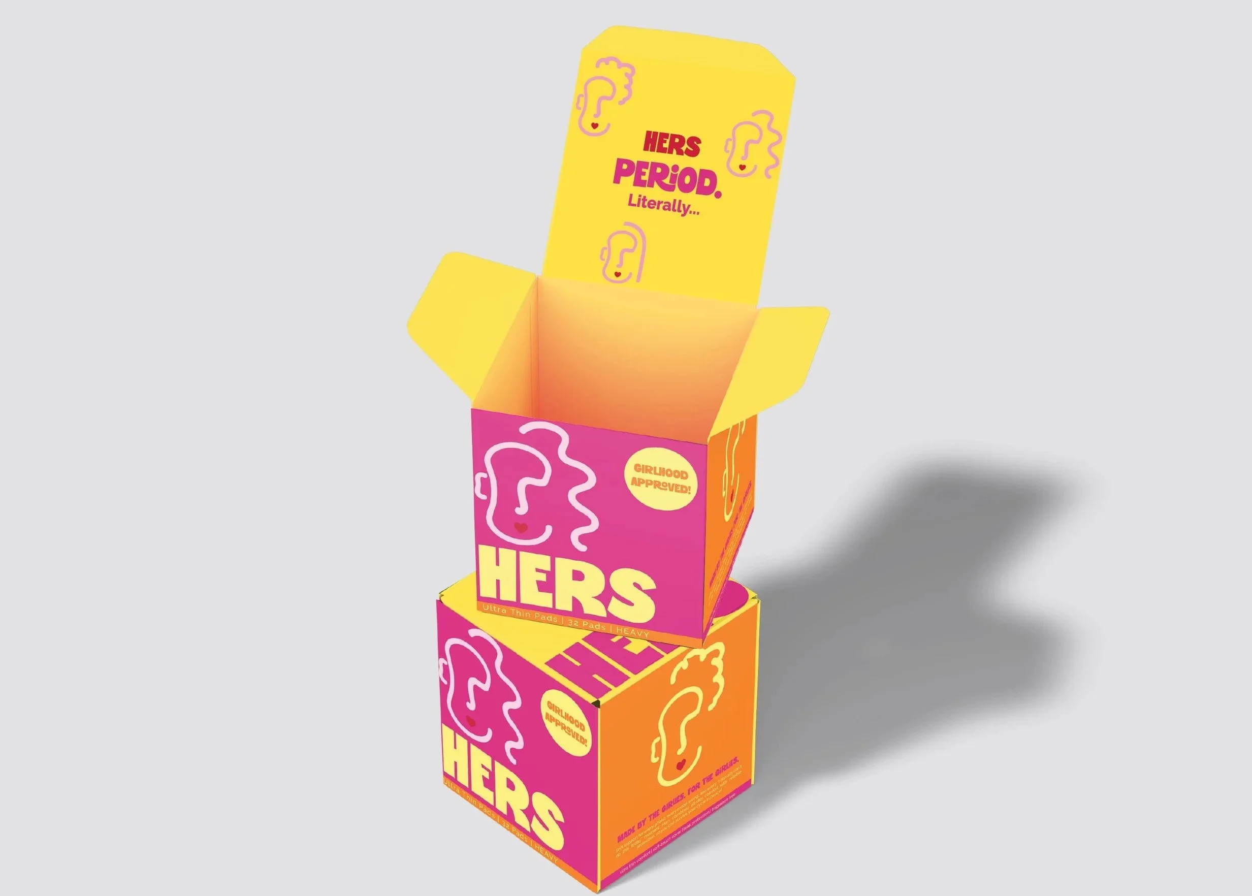
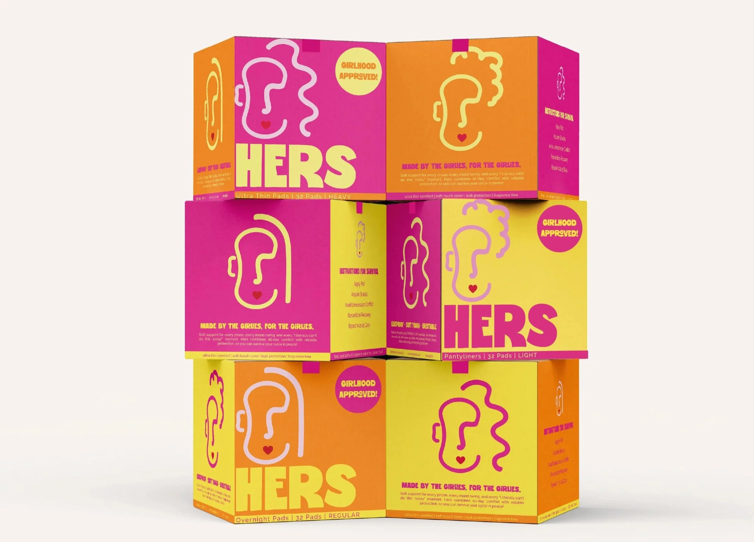
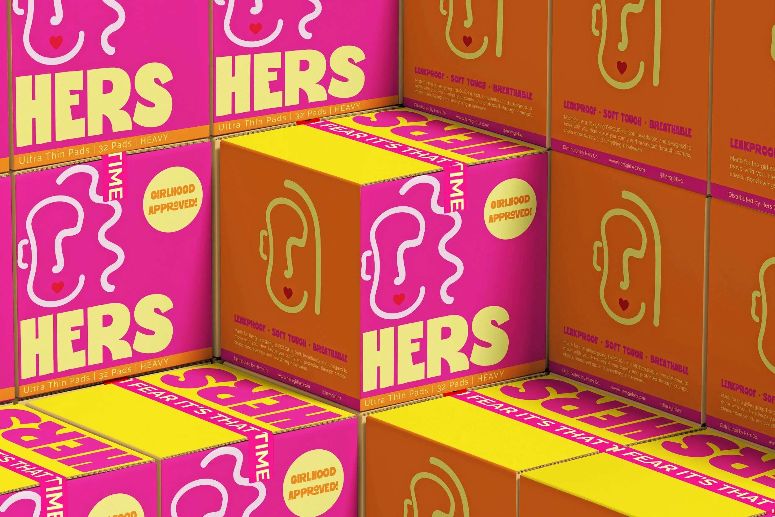
From pad boxes and individual wrappers to advertisements and supporting brand assets, every part of the brand was designed to feel fun, expressive, and full of personality. Instead of treating feminine care like something that needed to be hidden or toned down, the packaging leans into bold colour, playful illustration, and confident design choices that are meant to stand out.
The goal was to make period care feel a little more like girlhood itself: loud, playful, unpredictable, and proudly feminine. Designed to be seen, shared, and left out without embarrassment, HERS turns everyday feminine care into something open, fun and makes the best of the worst time of the month!